Why We Care About Ampersands
By NANCY UPPER – March 25, 2018
Ampersands began in human nature. For ever since mortals devised the first alphabets, 3,000-1,000 BCE, men and women have shortened words to ease the toil of writing. Frequently-used words like and — kai in Greek, et in Latin — people shortened to single strokes or symbols.
Crumbs of history that Time left behind reveal that the first sign for and arose from tachygraphy, fast writing that can keep pace with human speech (from Greek tachys, speedy, swift) — or arose from brachygraphy, writing in abbreviations or abbreviated characters (from Greek brachys, short).
The goal of tachygraphy is speed. The goal of brachygraphy, saving space. Ligatures, the joining of letters (from Latin ligat-, bound, from ligare, to tie), result from both speed and tightening. The ampersand arose from the rapid joining of et’s e and t.
The term shorthand covers tachygraphy, brachygraphy, and ligatures.
Greek and Latin abbreviated writing existed as early as the 4th century BCE. In the middle years of the Roman Republic (Republic traditionally dated 509 BCE – 27 BCE), scribes — freedmen, slaves, and women — developed a rudimentary Latin shorthand. During the reign of Emperor Augustus (born 68 BCE – died 8 BCE), Latin shorthand greatly improved. By the time of Seneca the Philosopher (born circa 4 BCE – died 65 CE), it was fully developed and widely used.
During the Middle Ages, scribal sigla (singular siglum, abbreviation), and the shorthand system that modern typographers named Tironian Notae, after Marcus Tullius Cicero’s freedman Tiro, grew to more than 13,000 characters. Scribes deployed these signs to write diplomas, royal deeds, and formal manuscripts, perhaps to safeguard against forgery. Writing official documents in Notae became so routine for scribes, they continued to imitate the marks long after they had forgotten their meanings.
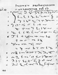
Psalm 68 written by an unknown scribe in the shorthand that modern typographers named Tironian Notae. Reprint of a 9th-century manuscript found in the German publication “Das Altertum” Band 12, Heft 1, 1966, p.44. Image source: Wikimedia Commons.

Through the 10th century, editors used the Notae to revise and annotate literary texts, but, in the words of paleographer Sir Edward Maunde Thompson (1840-1929), “even the pretentious vanity of the scribes could not protract the use of the notes, and they disappeared entirely in the 11th century.” The shorthand left most people cold, was too remote from meaning to remember, and was too artificial for business.
Only the “⁊” glyph, which allegedly signified et (and) in the Tironian system, lingers today in Celtic transportation signs. The ⁊ will display on Microsoft Windows in the font Segoe UI Symbol, and on Apple Mac iOS in Helvetica (Unicode 204A). Like a Phoenix rising from the Notae’s ashes, ⁊ remains an ember of the blazing Roman Empire.
A scribal survivor that thrived, multiplied, and ignited the world’s imagination is the ampersand.
Why did ampersands persist? Why did scribes delight in making them? Why did printers put ampersands in their fonts? Why did 15- and 16th-century calligraphers swing ampersands into flourishes that “our lariat-throwing cowboys would be quick to appreciate” — to quote American calligrapher Paul Standard (1896-1992, immigrated from Russia in 1903, quote is from his circa 1937 monograph The Ampersand — Sign of Continuity).
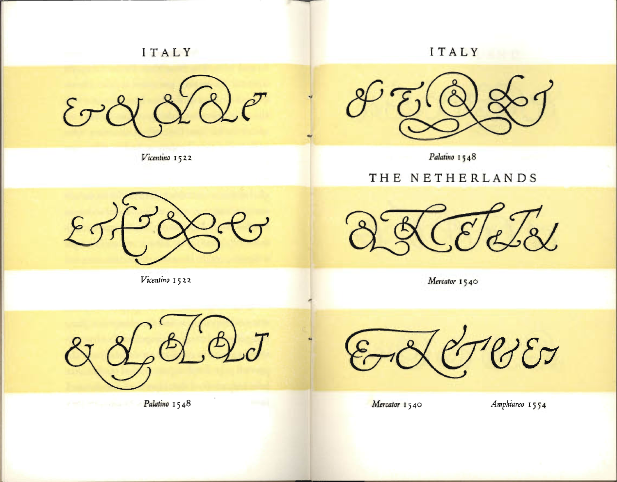
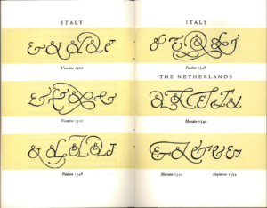 Ampersands of :
– Ludovico Vicentino degli Arrighi da Vicenza (c.1475-1480 – 1527), Italian printer, writing master, calligrapher.
– Giovanbattista Palatino (c.1515 – c.1575), Italian calligrapher and writing master.
– Gerardus Mercator (1512-1594), Flemish cartographer, geographer, cosmographer, engraver, calligrapher.
– Vespasiano Amphiareo (Italian, 1501-1563), Franciscan scribe and calligrapher.
In an interview, typographer and MacArthur Fellow Matthew Carter said:
You have to think of Gutenberg as a forger of manuscripts. He was trying to make books that looked like manuscripts, that looked like scribal writing. So he and his successors followed scribal practices in the characters of the font.
Of course ampersands were a common shortcut for scribes, so they got incorporated into fonts of type. Unlike some of the other scribal quirks, abbreviations, and other funny things you find in the earliest fonts which got dropped as printing type moved away from its roots in calligraphy, the ampersand stayed in there, and it’s still in there, very much so.
I think it was necessary because people were used to reading ampersands when they read manuscript books, and printers wanted to follow in that tradition as closely as possible.
Allan Haley, former Director of Words & Letters for Monotype, wrote in his book Typographic Milestones (New York: Van Nostrand Reinhold, 1992, p. 22), “Early 16th-century printers spoke of ‘writing’ a typeset page as if it were a letter to a friend. As this somewhat unusual terminology … implies, the typeface provided a much closer link between printer and reader than it does today.”
Paul Standard states in The Ampersand — Sign of Continuity that “worshippers” of the ampersand “may suggest that this humble sign survives because it had rendered some unique or necessary service. This is probably true.”
Standard continues:
Surely if the mediaeval scribe wished to render the Latin for and he could, and did, simply write et. This occupied no more linear space on his vellum page than the more deliberately formed &, and certainly no more time or effort. Occurring so frequently the plain word et, when spelled out, calls no undue attention to itself. And though practicality and subordination seemed to favor the word et, the signs & and & won the sanction of usage and the triumph of survival. Why? Plainly for aesthetic reasons.
I believe the ampersand outlived its kin for reasons deeper than scribal shortcut, reader familiarity, or aesthetic preference. I believe the ampersand thrives for reasons that spring from our deep, human needs for connection, belonging, identity, attention, structure, variety, and creativity.
- Connection. The ampersand began by connecting e and t of the Latin et (and) into a ligature. Like these two humble letters, you and I seek connections to create something greater than ourselves. We hold hands, shake hands, cuddle pets, join clubs, send cards, deliver flowers, dance together, kiss. Our hours spent on social media show how we yearn to connect with others. Connection enlarges us. Connection creates relationship. The ampersand excites us as a connection symbol.
- Belonging. We all need to feel we are a valuable member of a meaningful group. As a member of the typographic bloodline, the ampersand fulfills our need for community. Ampers personality attracts the attention we dearly desire.Ampers personality attracts the attention we dearly desire.Ampers personal
- Identity. Beyond feeling a valued member of a group, we need to feel unique within the group. Like snowflakes, trees, and people, no two ampersands are alike. Each is a unique member of its font family. We love the ampersand’s individuality and covet it for personal and professional branding to make ourselves distinctive.Ampersand personality attracts the attention we dearly desire.Ampersand personality attracts the attention we dearly desire.
- Attention. We all crave to be noticed, recognized, sought out. Why are ampersands everywhere? They have charisma. Katherine Hughes, Design Director at Stoltze Design in Boston, said in an interview:
As you learn to read, you are trained to see through the other letters of the alphabet, so you don’t look at them as forms. You see them as shapes that convey meaning and sound.
The ampersand is unusual enough that it stands out. So instead of looking through it, the ampersand calls attention to itself and makes you reflect on the craft that goes into making a letterform.
Ampersand personality attracts the attention we dearly desire.
- Structure. Our sizes, shapes, and looks vary widely, but the common elements of human anatomy give structure to our diversity. These structural constants instill a sense of security. We recognize people as humans and feel comfortable within our species.
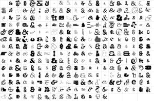
Similarly, innumerable ampersand variants exist and people make more every day. Some ampersands push the limits of recognition — but some people do too when disguised, costumed, or outfitted for their jobs as are astronauts and deep water divers. Diverse as ampersands are, their structural constants allow us to recognize them as the steadfast eccentrics they are.
Ampersands of the font Saintjean, a 2017 collaborative creation of the Velvetyne Free & Open Source Type Foundry, Paris, France.

- Variety. Variety is the essence of life. A variety of tastes, textures, sights, sounds, aromas, adventures, choices, challenges, passions, companions, and accomplishments creates life’s undulations. In book two of his six-book poem in blank verse The Task, published in 1785, English poet William Cowper (1731-1800) packed our need for variety into twelve words:
Variety’s the very spice of life,
That gives it all its flavour.
A different flavor runs through each ampersand. You need a variety of them to taste life fully.
- Creativity. Every ampersand is an act of creative courage by the person who designs it. “Creative courage is the discovering of new forms, new symbols, new patterns on which a new society can be built,” wrote existential psychologist Rollo May. Whatever sphere we may be in, he continues, however minor or fortuitous our creations may be, our “creativity is a yearning for immortality.” The ampersand symbolizes the courageous decisions we make daily to realize the self we want to become in is world.
When we learn the ampersand’s origin as a ligature of e and t — learn that the newborn glyph emerged from the coupling of letters ovate and erect — do we unconsciously sense that the merge mimics the creative act of conception? Perhaps American graphic designer Herb Lubalin sensed this in 1965, when he and typeface designer Tom Carnase conceived the in utero ampersand that remains a favorite. The baby gave their logo for Mother & Child, a magazine proposed but never realized by Curtis Publications, immortality in the world of design.

Mother & Child by Herb Lubalin and Tom Carnase, 1965

To these seven human reasons why we care about ampersands—
- Connection
- Belonging
- Identity
- Attention
- Structure
- Variety
- Creativity
— in 2013, Karen Pearson McKenzie, founder and creative director of Rhyme & Reason Design in Atlanta, Georgia, added three more. In her February 18, 2013, blog titled The Ampersand she wrote,
We admit we may be slightly obsessed with the ampersand. But as it turns out, we aren’t the only ones. It seems our beloved bilingual ligature has been trending toward pop culture stardom, and we think it’s pretty obvious why.
It’s timeless. The word ampersand — a combination of the phrase “and per se and” — found its way into common English sometime in the early 1800s. However, the symbol itself dates all the way back to Old Roman cursive from 1st Century A.D. … [T]wenty centuries is quite a run. And we thought the Rolling Stones have been around a while.
It’s simple. One of our tasks as creatives is to simplify. We condense notebooks of thoughts into one big idea. We reduce mood boards of images into a single logo. With 140 characters or less, we increase brands’ social media awareness. It only seems appropriate to love a mark so innately simple and self-contained.
It’s versatile. … Whether hastily scrawled or in beautiful script, between two words or standing alone, [an ampersand] always holds its own. [It] has recently developed popularity standing alone, featured on pillows, shirts, and notebook covers nationwide. We actually own an ampersand bottle opener — and yes, it’s as cool as it sounds. … [T]he ampersand will always be relevant to Rhyme & Reason.
Ampersands began in human nature, and the needs of our nature perpetuate them. Ampersands stand for eternal youth. To stay young of mind, heart, and body, keep an ampersand in view.
Ampersands have life force.
Ampersands connect us.
Ampersands rejuvenate.

Logo for B&E Organics designed in 2012 by Matt Vergotis of Gold Coast, Australia. Founder and Principal of Verg, Vergotis specializes in logo design, corporate identity, typography, and lettering design.
B&E Organics is a family business that provides and delivers certified organic food and groceries to customers in Brisbane and south-east Queensland, Australia.
References
Marshall, Bruce Atkinson, “ ‘Excepta Oratorio,’ the Other ‘Pro Milone,’ and the Question of Shorthand.” Latomus, Tome 46, Fascicule 4 (Octobre - Décembre 1987), p. 735 note 19, 22.
May, Rollo (1909-1994). The Courage to Create. New York, Bantam, 1976, pp. 14-15, 27, 32.
Millard, Alan Ralph. “Early Writing Systems.” World Archaeology Vol.17, No.3, (Feb 1986), pp. 390-398.
Thompson, Edward Maunde, Sir – British paleographer (1840-1929). An Introduction to Greek and Latin Palaeography. Oxford: Clarendon Press, 1912, pp. 73-75. For a full bibliography of Tironian Notae resources, on p. 74, footnote 1, Thompson suggests Introduction à la lecture des Notes Tironiennes (with 18 plates), 1900, by French scholar of Latin Émile Chatelain (1851-1933).
Standard, Paul, Melvin Loos, and Clarence Pearson Hornung. The Ampersand – Sign of Continuity. New York: Typophiles, George Grady Press, circa 1936-1937.