Ampersand Pretzels
Two things everyone loves are pretzels and ampersands. Bring the two together and you have a sold-out house.
September 19, 2019, pretzels, ampersands, and graphic designers merged in the sold-out “Power of Ampersand” event hosted by AIGA Boston — local chapter of the largest professional association for design. October is National Pretzel Month, but, a leader since its founding in 1984, AIGA Boston opened this September event with free pretzels for all attendees. Even better, these were ampersand pretzels.
My current book is about the ampersand’s origins, development, typography, worldwide uses, and triple powers. “Power of Ampersand” featured my slide presentation of ampersand know-how useful to designers. When I began research in 2010, I was working as volunteer journalist for Darin Murphy, Head Librarian of the W. Van Alan Clark, Jr. Library in the School of the Museum of Fine Arts (SMFA), now the fine arts branch of Tufts University’s Tisch Library. Murphy’s encouragement of my ampersand work gave me confidence that a book about what some consider a superficial mark was a valuable pursuit.
As AIGA Boston president Lauren Yanko and I planned “Power of Ampersand,” I proposed the SMFA library as our venue. Benefits of the library included easy access by public transportation, the library’s appeal to designers, and the opportunities it opened to connect with students.
Murphy replied to my call enthusiastically. By luck, our preferred date of September 19 was free on the SMFA calendar. Murphy wrote us in.
To excite all the senses with the ampersand theme, I suggested to Yanko that we offer pretzels in the ampersand shape and A&W root beer as thirst-quencher. Her affirmative reply sent me in quest of bakeries, pubs, and breweries receptive to making ampersand pretzels. Boston Magazine’s April 2019 article “The 12 Best Pretzels in Boston,” by Jacqueline Cain, provided a good start. Some of the 12 seemed too fancy — chocolate-dipped rods, pretzel ice cream cones — or were more rounded than twisted. Distance between pretzel-maker and SMFA was another factor, to ensure prompt delivery at rush hour.
Since the mid-1990s, I had seen Boston Pretzel push-carts all over town — at Boston Common, Faneuil Hall, Government Center, Museum of Science, festivals, parades, and sports events. In June 2019, I wrote to the email address on bostonpretzel.com, explained our event, and asked if Boston Pretzel bakers would make four dozen pretzels in the ampersand shape. Owner Linda DeMarco replied, “Always up to a good challenge. We do our own twisting, so let me test it out and I’ll let you know how it goes.” Boston Pretzel makes 175,000 pretzels a year in standard and custom shapes. DeMarco’s confidence implied success with our ampersand request.
DeMarco and I exchanged more emails and spoke by phone. At the end of August, we confirmed 48 pretzels, and 5:00 p.m. delivery on September 19 at the SMFA entrance.
At 4:00 p.m. on the 19th, Yanko and I arrived at the SMFA library to begin setup. At 4:45, we walked down to the entrance to wait for Boston Pretzel. Right on time, a car pulled to the curb and DeMarco hopped out of the driver’s seat. We introduced ourselves. “These look so beautiful,” she said, “I had to deliver them myself!” DeMarco introduced us to the friend with her, Pam Sinnett.
Sinnett, Yanko, and I gathered around the rear of the car as DeMarco opened the hatchback. A delicious aroma emanated from four cardboard boxes stamped with the Boston Pretzel logo. DeMarco opened a box and lifted out a twelve-inch high, eight-inch wide ampersand pretzel sprinkled with sesame seeds. She said, “I made an extra-large sample for you as a display piece.”
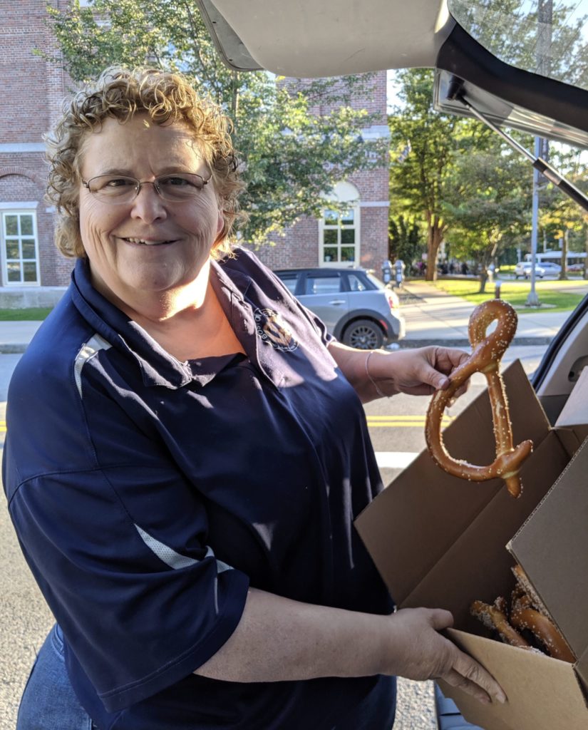
“What a beauty!,” I said. “Thank you, Linda!” DeMarco tilted the box to show Yanko and me the dozen smaller ampersand pretzels inside. Yanko said, “These look marvelous! Thank you so much.” She and DeMarco exchanged invoice for check. Payment made, we unloaded the four boxes. Yanko and I in turn shook DeMarco’s hand and thanked her again.
The W. Van Alan Clark, Jr. Library is on the top floor of the SMFA building, three zig-zag flights of stairs up from ground level. Shunning the elevator, Yanko and I carried the boxes of pretzels up the stairs to the event room at the back of the library. As we passed the circulation desk, library workers thrilled at the fresh-bread aroma.
Near the 6:00 p.m. start time, people poured in. The pretzels began instant conversations between friends and strangers. I smiled as I watched the “ampersand effect” pervade the room. Since mankind learned to turn grain into flour and bake it into a staple of life, bread has connected people. Bread dough shaped into ampersands augments connections. To a talk that folks would soon see and hear, the pretzels added taste, touch, and scent. The more of our senses an experience touches, the more memorable the experience.
Murphy dimmed the lights and my title slide filled the screen. An A-major guitar chord sounded to proclaim the words “Power of Ampersand.”
My first presentation slide showed, in the lower left corner of the screen, the 1975 cartoon by illustrator Jerome Snyder (1916-1976) of Eve & Adam. I said, “How did the first humans increase —” the photo of a huge crowd filled the screen behind the cartoon “—to billions of people? Our passion to connect,” the word CONNECT appeared. “Our need to communicate,” the word COMMUNICATE appeared. “Our drive to create,” the word CREATE appeared.
The next slide showed this graffito large in the lower left corner of the screen. “How did a Pompeiian graffito increase —” a huge spread of ampersands rose behind the graffito “—to billions of ampersands? Same passion to CONNECT, need to COMMUNICATE, drive to CREATE.”
The ampersand effect of the pretzels proved my first points. Ampersands prompt people to connect, and when people connect they communicate. When designers communicate, creative ideas emerge.
I continued, with slides to illustrate. “Since mortals devised the first alphabets, men and women have shortened words to ease the toil of writing. Frequently-used words like and people shortened to single strokes or symbols. Latin word for and is et. The ampersand evolved from joining the e and t of et into a ligature. No one knows who first joined e and t, but —
“But after Mount Vesuvius erupted and buried Pompeii in 79 CE” — Karl Bryullov’s gripping 1833 painting The Last Day of Pompeii filled the screen — “the graffito found on an excavated wall gave the first proof of the e-t bond.” showed on a wall in the painting. “Typographers call this graffito the father of the ampersand family.”
I watched the audience work through their pretzels while I worked through my slides.
“The need to communicate faster led to Roman Cursive.” My slide showed a progression of cursive e-tligatures from 79 to 500 CE. “By the year 500, cursive had merged the e-t ligature into the ampersand shape we recognize today.
“As the medieval scribe copied page after page in his cold scriptorium, he wrote et for the Latin and. He preferred by far rendering &, for the et-sign was the one character to which he could add the most personal style. Making et–signs relieved his tedium, and they served as blossoms on the page to hold the reader’s interest. Over the centuries, scribal liberties with the sign gave it lively variations. The useful ligature turned into an aesthetic statement.
“History credits Johann Gutenberg (c.1398-1468) for bringing together the techniques to print a typographic book. People were familiar with et-signs from reading them in handwritten manuscripts. Gutenberg and his successors wanted to follow the manuscript tradition as closely as possible, so they incorporated et-signs into their fonts of type.
“In 15th century England, the commonly used layman’s prayer book was called a primer [pronounced PRIM-er], because it was often the first book — liber primarius — a household owned. Primers contained alphabets and prayers, and helped children and adults learn to read and write English and Latin. By the 1490s, English printers made fortunes printing primers in quantity.
“The alphabets in primers showed the et-sign as the 27th letter.
A B C D E F G H I J K L M N O P Q R S T U V W Z Y Z &
When children recited their A, B, Cs, teachers taught them to say : A B C D E F G … X Y Z ‘and per se and,’ meaning, ‘the symbol &, by itself, is the word and.’ As the kids repeated, ‘A B C D … X Y Z and per se and’ — ‘… X Y Z and per se and’ — ‘… and per se and’ — ‘… and per se and’ — the phrase turned into the dandy word ampersand.
We’ve called the et-sign ‘ampersand’ ever since.”
Abbreviated remains of pretzels — crumbs, sesame seeds — scattered the ampersand effect across the long center table, into laps, and onto the floor.
“The ampersand surged into business where it saved space in company signage and logos. Balson & Son, butchers since 1515. Paxton & Whitfield, cheese mongers since 1797. Tiffany & Company, since 1837. Arm & Hammer, since 1846. And so on today.
“The Industrial Revolution lifted ampersands into advertising where they attracted attention in Europe, in America, and around the world. Companies sought to distinguish themselves, and the ampersand did it for them.
“With business and advertising leading the way, ampersands entered all fields of global enterprise. French painter Georges Braque stenciled one onto his 1911 painting The Porguguese. Poets, such as William Blake, E.E. Commings, Ezra Pound, John Berryman, wrote ampersands into their lines. Cummings named his 1925 collection & (and).
“In 1978, the Swedish women’s and men’s apparel retailer Hennes & Mauritz rebranded as H&M. In 2000, H&M opened its first U.S. store on Fifth Avenue.
“In 2014, in Rwanda, a climate change expert and three solar engineers founded Ampersand electric motorcycles. Ampersand’s mission is to build affordable electric vehicles that run on solar-charged batteries for the three million motorcycle taxi drivers in East Africa. Going electric double’s a driver’s income and speeds Africa toward a zero-carbon future.
“In 2016, the Parisian design studio Van Peteghem Lauriot Provost (VPLP) unveiled a 100-foot sloop christened Ampersand. The vessel is named after the ampersand symbol for the design’s fusion of competitive and cruising worlds.
“In Auckland, New Zealand, the Ampersand eatery attracts the hungry. Its red neon logo double-serves — as branding symbol and people-connector.
“Strategy& [pronounced ‘strategy and’] is the consulting muscle of the PricewaterhouseCoopers network. The ampersand tail on the company name stands for a mouthful of business capability — supply-chain management, product-and-service innovation, merger-and-acquisition expertise, global strategy consulting. One symbol holds a powerhouse of know-how.
“Today, the combined value of companies with the ampersand symbol, and companies named Ampersand, totals TRILLIONS of dollars.”
My next slide showed the big word WHY in the middle of the screen. “WHY has the ampersand survived and thrived, from ancient graffito to global necessity, while other scribal marks fell out of use ?” As I answered the question, three words showed in succession:
“Our passion to CONNECT.
“Need to COMMUNICATE.
“Drive to CREATE.
“You must connect to communicate, and communicate to create. The ampersand powers all three.”
I continued my talk with the ampersand’s typographical features, triple powers, and the explosion of worldwide ampersand use.
Triple powers? Yes. Every ampersand does three or more things at once. For example, an ampersand is a word, a symbol, and a metaphor. In the logo

— the online music store that offers instrument rentals, music lessons, and instrument repair at its nationwide locations — the ampersand stands for the word and, is the symbol for and, and is a metaphor for music. Notice the eighth note in the &.
Another triple power: an ampersand is useful, aesthetic, expressive. The ampersand pretzels made a useful pre-talk snack, offered an aesthetic twist on the traditional shape, and expressed the presentation theme.
My talk illustrated seven such triads. The ampersand:
- Is a word, symbol, metaphor.
- Is useful, aesthetic, expressive.
- Contracts, connects, expands. As in Strategy&, where the ampersand contracts vast know-how into a single symbol, connects strategy to performance, and expands pioneering ideas into global achievements.
- Is masculine, feminine, or neutral.
- Is versatile, timeless, simple.
- Embodies past, present, future.
- Extends history, tells a story, drives action.
This mark that most of us scrawl with a turn of the hand possesses astounding strength and depth.
My penultimate slides illustrated how the ampersand is a symbol of optimism. “You have a passion to connect,” I said. “Connect with optimism. Use an ampersand to join what you did to what you will do. Positive outcomes will result.
“You have a need to communicate. Communicate with optimism. Talk to people. Write to people. Communicate visually. Doors will open for you.
“You have a drive to create. Create with optimism. Combine what is within you with what is outside to make something only YOU can create.”
My ending slide showed a crowd cheering an airborne ampersand. I said, “The triple-powered ampersand — edible and otherwise — strikes a pose and strikes a chord [A-major guitar chord]. Around the world, it’s adored. Thank you!”
Applause. Questions and answers.
In June 2019, during event planning, Yanko conceived the superb idea of
an ampersand letterpress postcard to give attendees a keepsake. The online event announcement included this call for submissions:
How does the ampersand take shape for you?
We’ve partnered with Goosefish Press to demonstrate the ampersand
as a connector in many forms. Submit your hand drawn ampersand as
appropriate for letterpress (100% black, no tonality or screens) by
August 26th to be included in a printed piece that all event attendees
will receive.
That same June, DeMarco had emailed, “Always up to a good challenge.” Goosefish Press and thirteen AIGA Boston members responded with similar gusto to produce this four-by-six-inch memento. The original card did not have numbers. Numbers added here to credit designers.
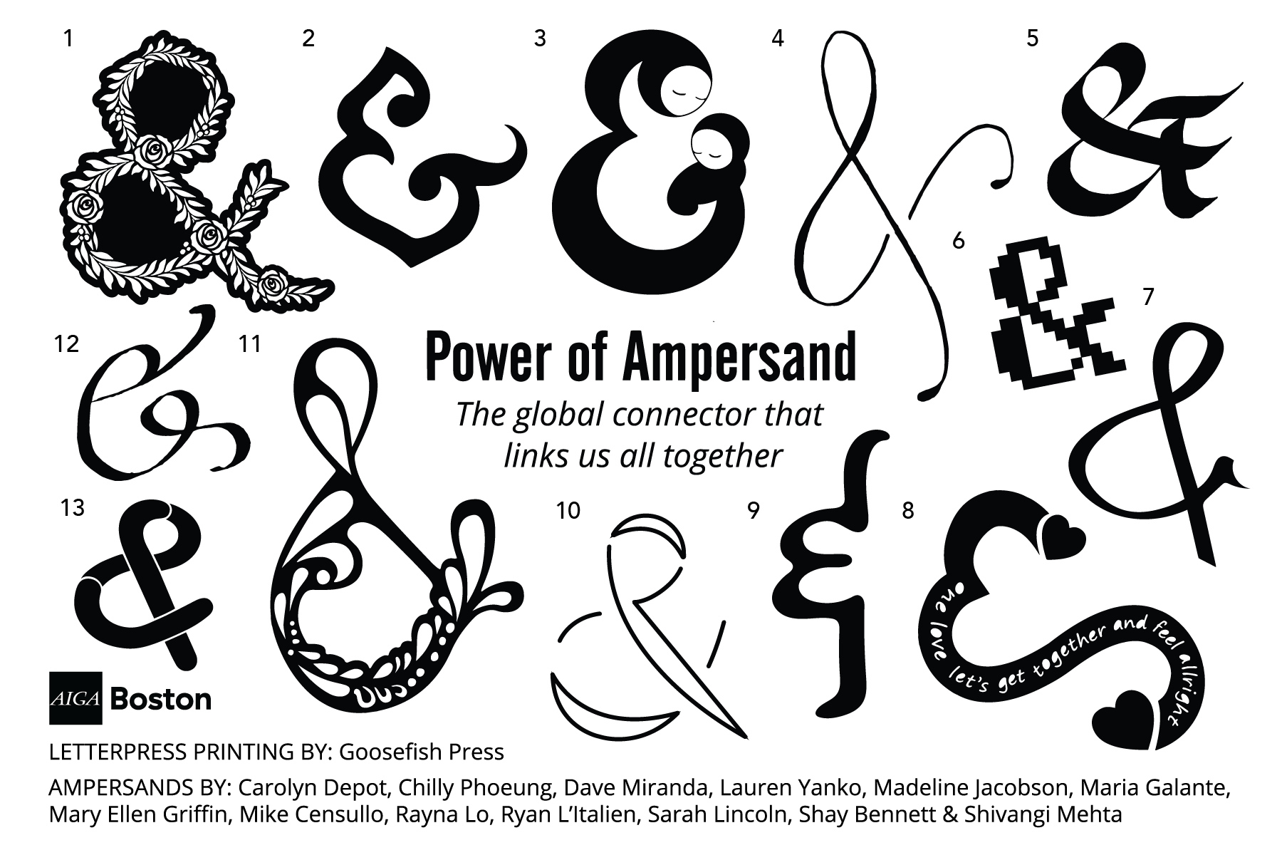
1 Madeline Jacobson
2 Mike Censullo
3 Rayna Lo
4 Sarah Croughwell Lincoln
5 Dave Miranda
6 Ryan L’Italien
7 Shivangi Mehta
8 Shay Bennet – Words in the ampersand: one love let’s get together and feel all right
9 Lauren Yanko
10 Carolyn Depot
11 Mary Ellen Griffin
12 Maria Galante
13 Chilly Phoeung
I hoped the audience had internalized my talk as eagerly as they had internalized the pretzels, for by evening’s end, every ampersand pretzel was gone. A library worker took the last eight home for her housemates, carrying the event’s message of connection beyond the walls of the W. Van Alan Clark, Jr. Library. Attendees pocketed all of the post cards, except for the few we saved for library and AIGA Boston archives. And they took home my handout of the ampersand’s triple powers. Pretzels, post cards, and handout gave attendees a triad of extras.
“Power of Ampersand” extended AIGA history, told a story of how and why the ampersand rose to global importance, and inspired creative action by baker and designers. Ampersands and sesame pretzels gave the crowd good food for thought.
• • •